INTERIOR DESIGN

How to decorate a modern living room

how-to-decorate-a-modern-lviing-room.jpg

Adding Decor accents to the living room is like wearing jewelry. Too much jewelry distracts your eyes. Adding too many decor pieces is just like putting on too many accessories at once. The key is to add few interesting pieces to grab attention. After your furniture is laid out, the accessories in the space really make a room stand out. Even the rug pattern, the drapes should not be overlooked. Let's dive into the details of decorating.

HOW-TO-DECORATE-A-LIVING-ROOM

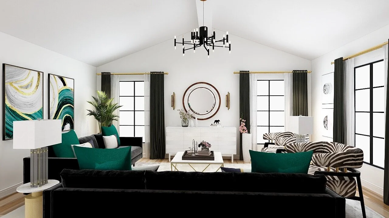
ACCENT CHAIRS

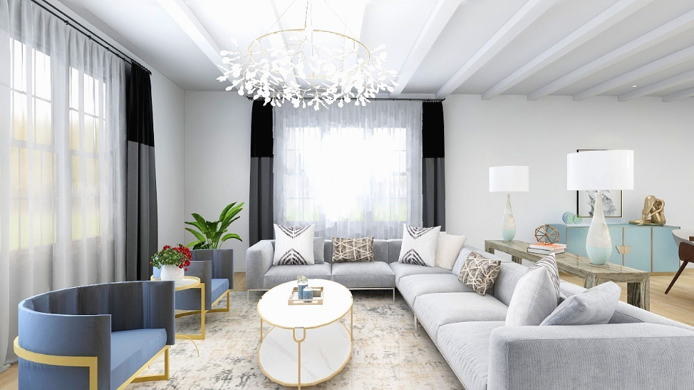
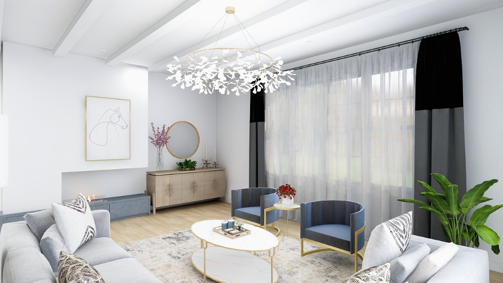
This living area includes a beautiful sectional paired with unique accent chairs.

Here are some of my top picks for accent chair options for this modern living room. (To purchase click on the image directly.)

This post does contain affiliate links. That just means that I may earn a small commission when you make your purchase at no cost to you.

LAYER YOUR ACCESSORIES

Layering the decor pieces requires a bit of practice but not impossible to achieve. Adding too much decor together can be distracting and you might find it hard to rest in one area. A good rule of thumb is to use pieces with different heights, textures, and a color palette that will help your accent details look beautiful!

PILLOWS AND RUGS

Choose your favorite pillow combination, these will surely bring spirit to your living room. Also, there are some beautiful rug selections, these are my favorite.

This post does contain affiliate links. That just means that I may earn a small commission when you make your purchase at no cost to you.

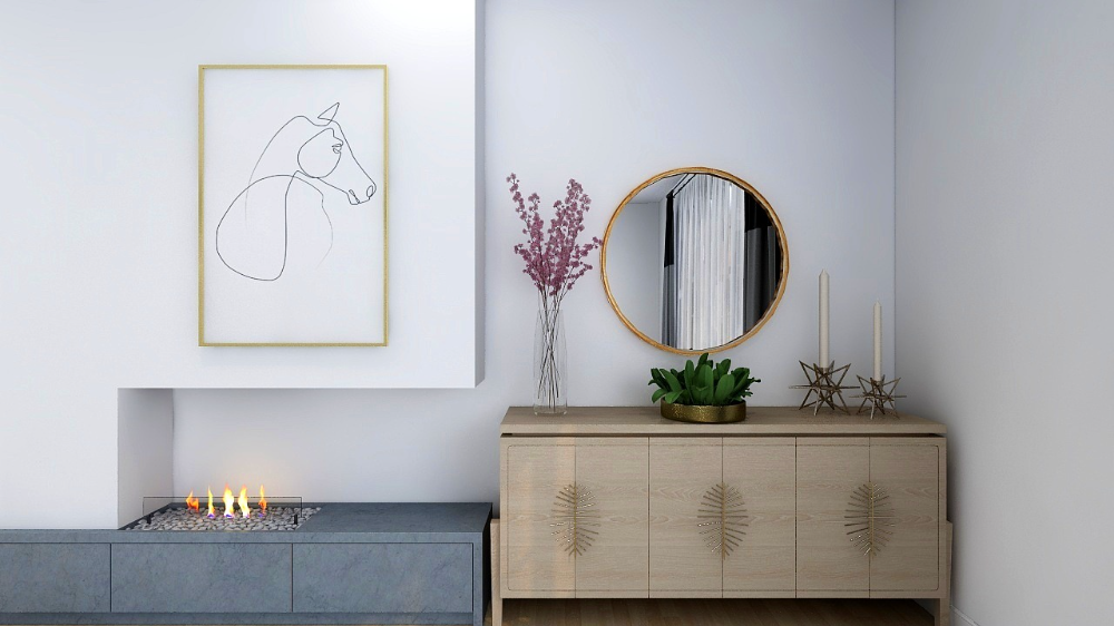
MODERN-CONSOLE-HOME-DECOR

CONSOLE TABLE AND STYLING ACCESSORIES

Here are some of the console table options and accessories to style with.

This post does contain affiliate links. That just means that I may earn a small commission when you make your purchase at no cost to you.

LESS IS MORE

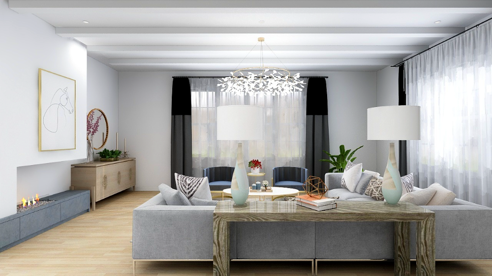
You might have heard this term, less is more. This can apply not only to your furniture pieces but also to your decor selection. Another tip is to choose bigger items and let go of most of any little items. Here is an example shown in the above image.

MODERN-LIVING-ROOM-FIREPLACE

POSITIVE AND NEGATIVE SPACE

There are always positive and negative spaces in every area of our home. For example walkways and distance in-between furniture. Positive spaces are where we place furniture, and negative spaces are empty unused spaces. The same rule should be applied when accessorizing your living room. A home decor should be layered and have negative space on the surface where they are displayed. The biggest challenge while decorating a home could be finding the right balance between positive and negative space making a room looks cluttered.

STYLING-CONSOLE

THE RULE OF THREE IN DECORATING

Don't let your room look boring after some time change your accessories often! It can be as simple as adding fresh flowers or adding a stack of books to a table or adding table lamps. Playing with the details will keep the room look fresh.
The decorating magic number three is like a golden rule! A grouping of three objects of various heights is visually pleasing and will make your eyes travel from one decor to another. You can also apply this rule of three for styling a coffee table, decorating a mantel, or even arranging furniture in a room. Here are some ideas to use while accessorizing- Books, plants, vases, bookends, vases, candles sticks, picture frames.

If you need help to design and decorate your unique space, we can help. We will ensure to reduce the shopping overwhelm and make your home comfortable to live in. To start your custom project email us at jenny@jennychohaninteriors.com.

 

Get your complimentary guide

how-much-does-decorating-cost

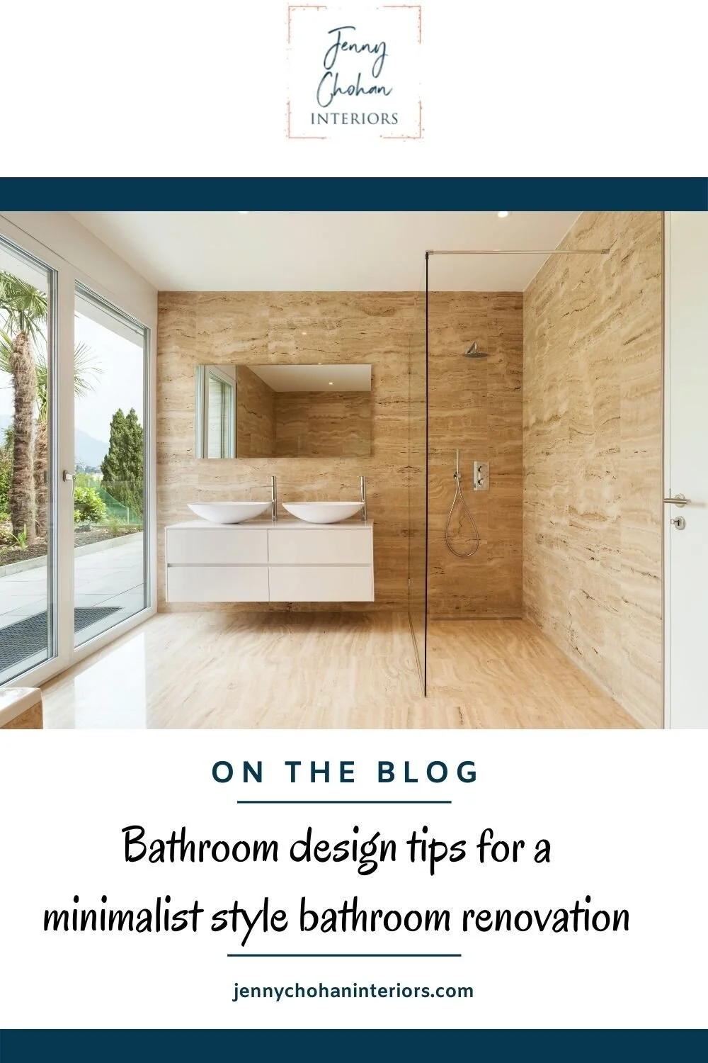
Bathroom design tips for a minimalist style bathroom renovation

bathroom-design-tips-minimalist-style

Bathroom Renos can feel stressful! changing tiles, changing fixtures, adding new light fixtures, and plumbing. And being a working mom you would like to create an overall clean and organized vibe. The minimalist design style is on the rise and is perfect as a go-to design style with our lifestyle while bringing us peace and calm in our daily chaotic life. A sleek and simple bathroom will refresh your space, your mind, and your life. Check out these tips on how to create the minimalist bathroom of your dreams.

Minimalistic bathroom color palette

To achieve a zen-like feeling of a minimalist bathroom, choose one base hue and use different shades overall. Choose a neutral color palette for your wall and floor tiles, paint, and countertops. To create contrast add dark fixtures as accents. For example brass, black or gold fixtures.

3.jpg

Spa-inspired bathroom with wellness in mind

Our lives have become more stressful than ever so unwinding can soothe mental wellbeing. And since our work-lives and home-lives have become so intertwined during the Pandemic, we are seeing a stronger desire to invest in our homes so that wellness is more of a priority than ever before. Spa-inspired bathrooms can be achieved by adding a steam shower which includes Aromatherapy and music therapy to regularly reap its health-enhancing benefits for the respiratory system, skin, physical resilience, and mental well-being. 

4.jpg

Minimalistic design elements

Design elements of a minimalist style bathroom are floating vanity, curbless shower, frameless shower, freestanding soaking tub.

Let’s look at floating vanities. They are elevated countertops that visually add space to the bathroom by giving the room an airy feel, often without sacrificing the drawers that store washcloths, toothpaste or other bathroom essentials. 

Next, frameless shower panels, as the name suggests these don't have frames and therefore are less likely to form mold or corrode. Another advantage is that because it's frameless it provides a clean minimalist look.

Freestanding soaking tubs are gaining so much popularity. These tubs also come in a wide range of materials and finishes, such as wood, copper, and enamel, and can add a feeling of luxury and sophistication to the spa.

5.jpg

Natural elements and Biophilic design

Add wicker baskets, and natural materials like natural stone, concrete, and timber veneers into the bathroom to enhance the spa-like feel. Nature-oriented bathrooms are becoming very popular and the look is relatively easy to achieve. Add some potted plants to your bathroom to create a biophilic environment. Plants will not only add visual beauty, but they also clean the air. Some examples of houseplants are spider plants, snake plants, aloe vera, and bamboo.

The housing market is continuously on the rise and homeowners are looking for upgraded bathrooms. If you need help with picking fixtures and finishes for your bathroom, we can help through our designer for a day service. Please email us at jenny@jennychohaninteriors.com or book a complimentary discovery call to discuss your next bathroom remodeling project. 


GET A COMPLIMENTARY E-BOOK

how-much-does-it-cost-to-renovate

Interior design secrets for creating a cohesive living room

Interior-design-secrets-for-creating-a-cohesive-living-room.jpg

Wondering how to make a room look cohesive to achieve a designer look? I’m sharing three main designer's secrets to put your room together in style!

Define Your Design Style

Everyone has their own unique design style, you do too! You may say, I'm not sure what my design style is and how to blend two styles together. Don't worry, select your two favorite styles, for example here we have modern style furniture with glam accessories to tie everything together. Some people make a mistake matching all the furniture pieces which lacks interest and personal touch.

Creating a Furniture arrangement

While designing your space it’s important to understand furniture arrangement. The most common mistake is to position sofas against the walls. If the furniture is not laid out properly it looks cluttered and affects the traffic flow in the room. Make sure the furniture is away from the walls and there is enough space between furniture pieces. For example, there should be at least 18 inches between a coffee table and the sofa.
Another tip is to lay out the furniture around the focal point of the room. Most people think that that it has to be a TV or fireplace. The focal point could be anything in a room defined by the use of the space by the homeowners.
HOW-TO-CREATE-COHESIVE-LIVING-ROOM.jpg

Nail your proportion

While selecting furniture, choose pieces that are proportionate to each other. A small rug in a large living room just looks off or a small table lamp on the tall side table. Another tip is to choose sofa size according to the room size. A bulky sofa is going to look out of proportion in a small living room.

BLACK-SOFA-GREEN-CUSHIONS-LIVING-ROOM.jpg

Create storage solution

One of the main reasons your living room doesn't look cohesive is when you have too much hodgepodge around. Remove all the extra clutter and use cabinets to store toys and games in storage bins if your kids are little and put them away when not in use.

Cohesive color palette

The last thing you should choose is paint! Open concept spaces connecting other spaces should especially look cohesive. To achieve a feeling of continuity choose two to three colors throughout the house. Each color can be used in different values and intensities to produce a wide range of effects. For example, if you are painting navy blue kitchen cabinets, then choose a light shade of blue for the adjoining living room walls. Another tip is to paint all the trims the same shade throughout the house to create a sense of flow from one space to another.

LIVING-ROOM-MID-CENTURY-STYLE-BRANTFORD.jpg

If you wish to purchase these furniture pieces for your living room, click on the items below.

Disclosure: The links below are affiliate links, meaning, at no cost to you, I will earn a commission if you click through and make a purchase.


GET YOUR COMPLIMENTARY E-BOOK

how-much-does-it-cost-to-renovate

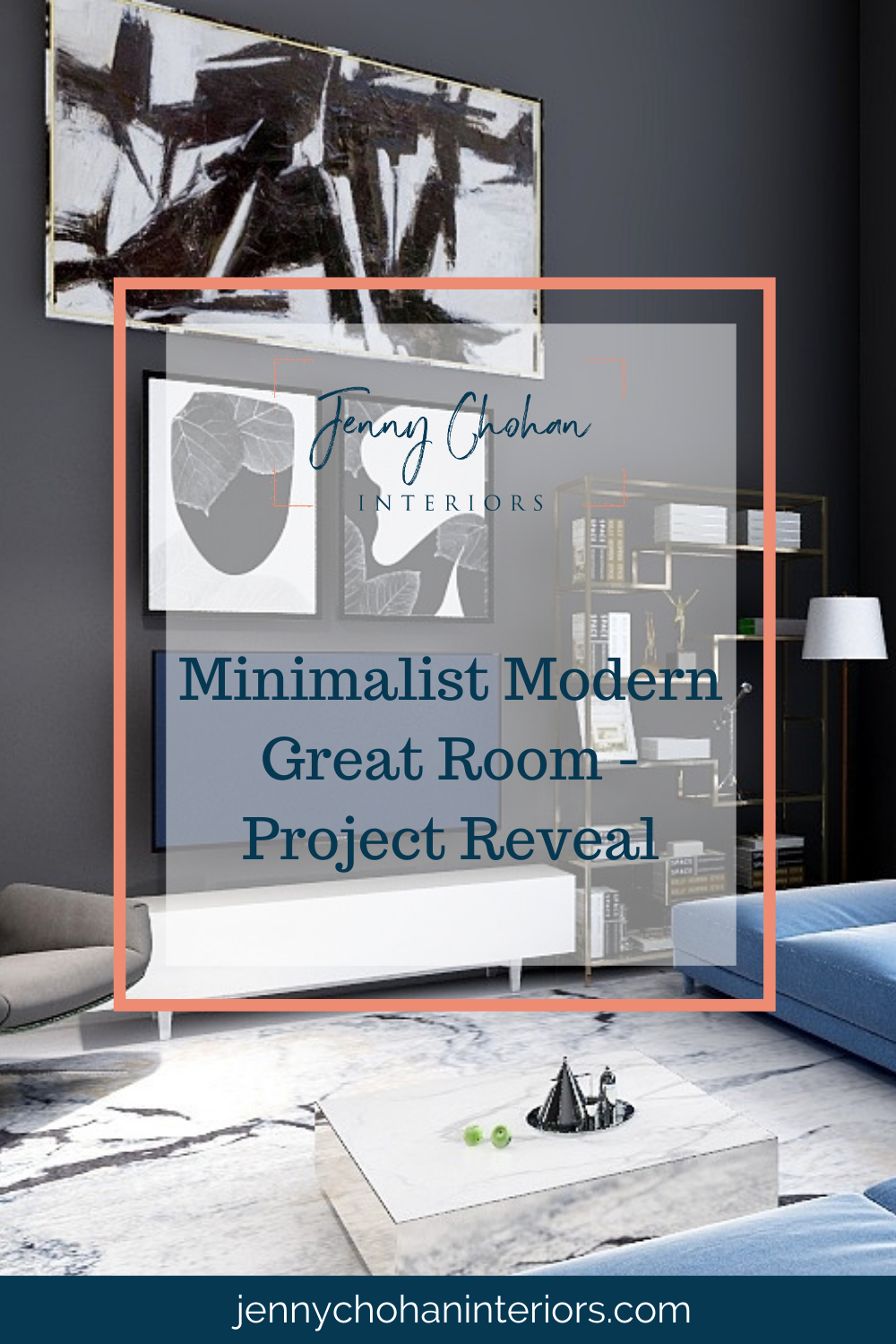
Minimalistic Modern Great Room - Project Reveal

Minimalist-modern-great-room-PROJECT-REVEAL

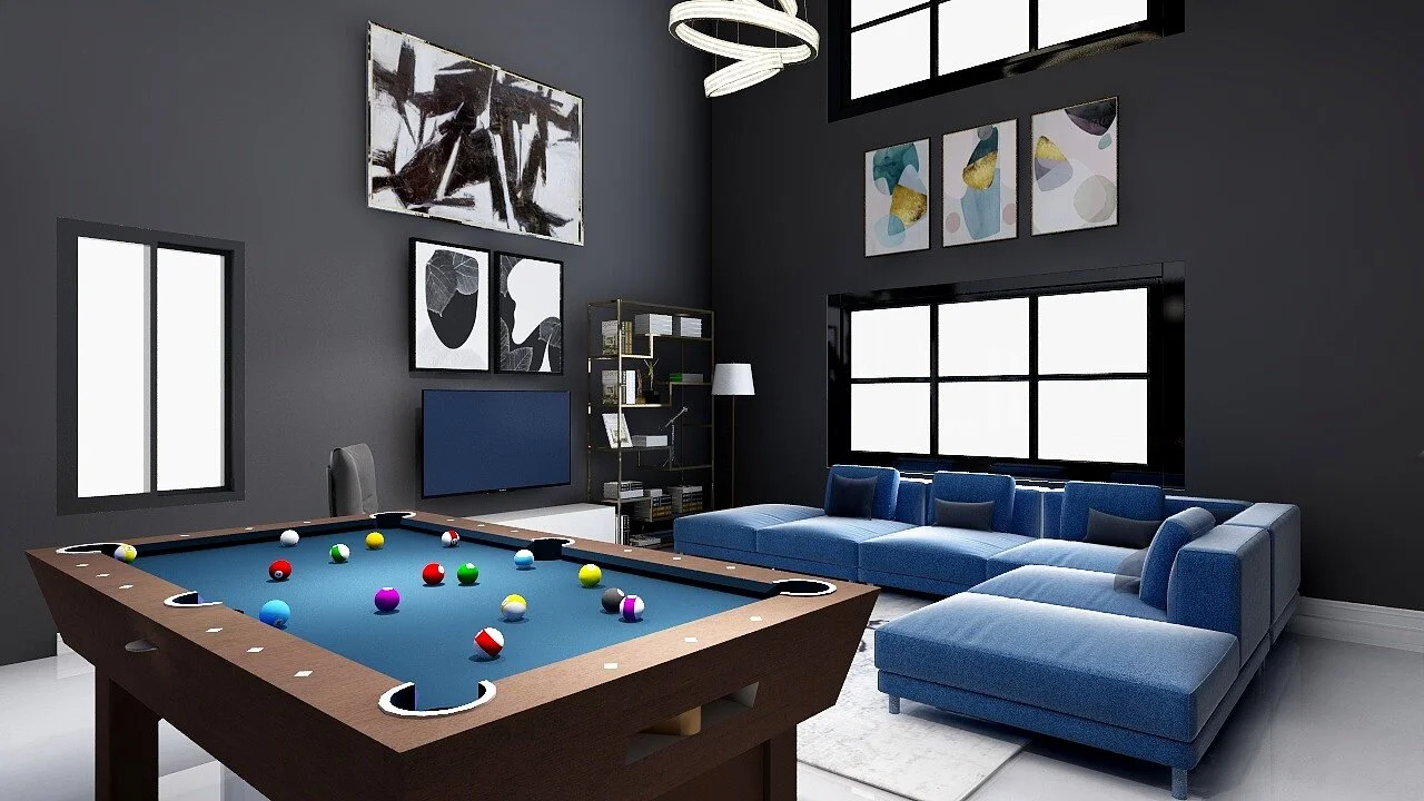
Our clients reached out to design this beautiful open concept great room in a newly constructed house in Florida, USA. 

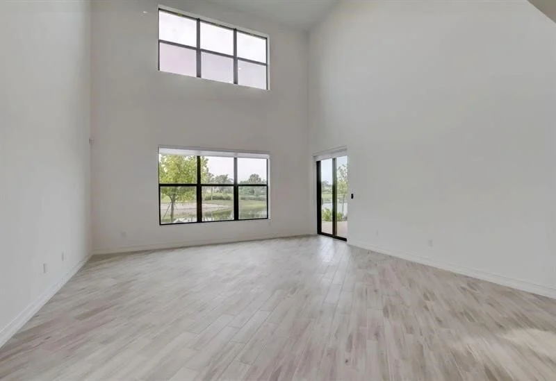
The goal of this project was to achieve a minimalistic modern style. Our clients were very specific about what they were looking for! They thought that having a 22 foot ceiling will be a challenge in creating this clutter free,yet cozy and inviting space for family and friends. The requirements for the great room were as follows:

  • Incorporate existing pool table.

  • Storage options for cue racks.

  • Media console.

  • Minimalistic furnishings for the space. 

  • Great room area seating.

  • Black walls

Before: Great room in a newly built home

Before: Great room in a newly built home

Before : Great Room view from the Kitchen

Before : Great Room view from the Kitchen

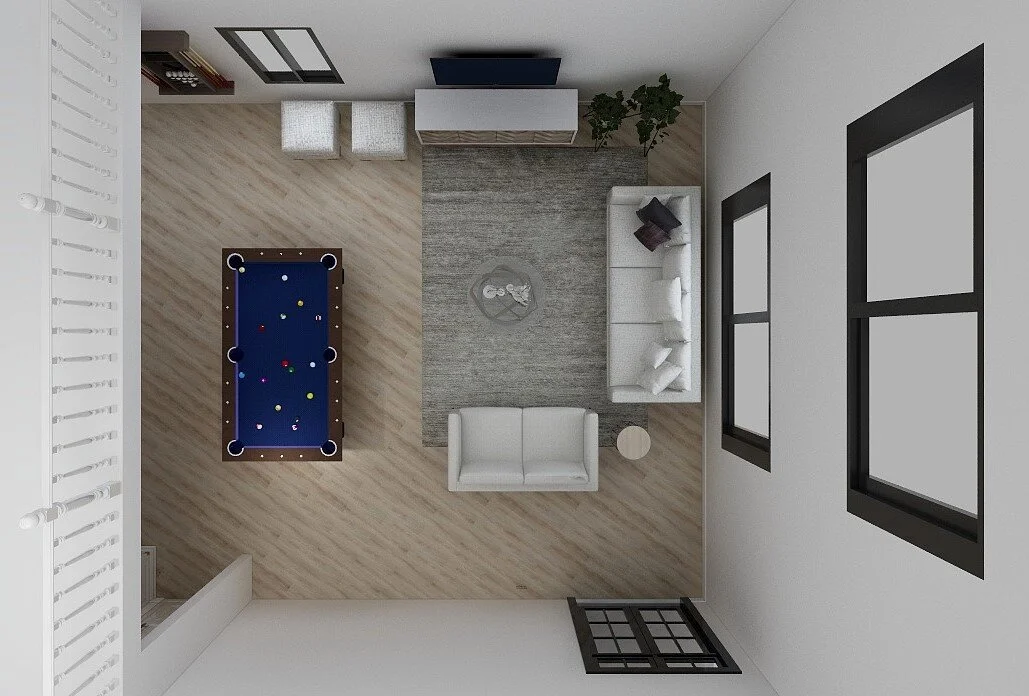
We came up with three floor plan options.

3D Floor Plan - Option # 1

3D Floor Plan - Option # 1

3D Floor Plan- Option# 2

3D Floor Plan- Option# 2

3D Floor Plan- Option # 3

3D Floor Plan- Option # 3

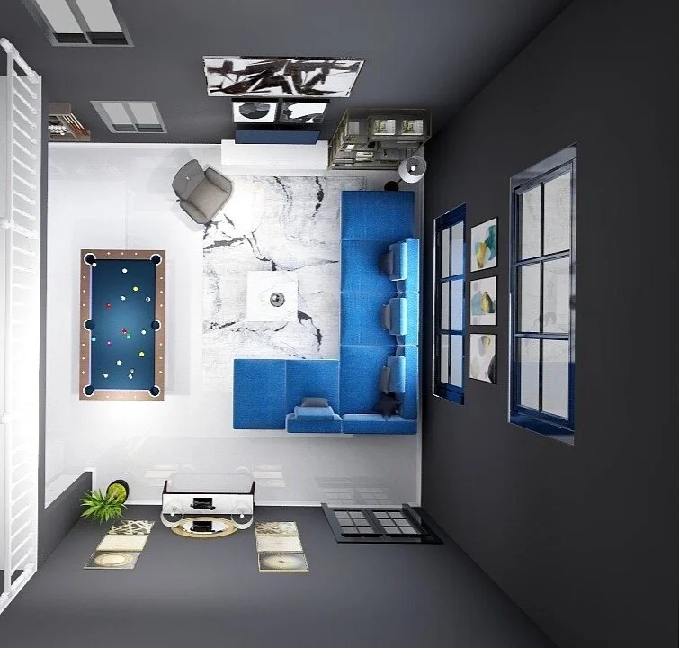
Our clients decided to go with Option no.3 for floor plan layout.

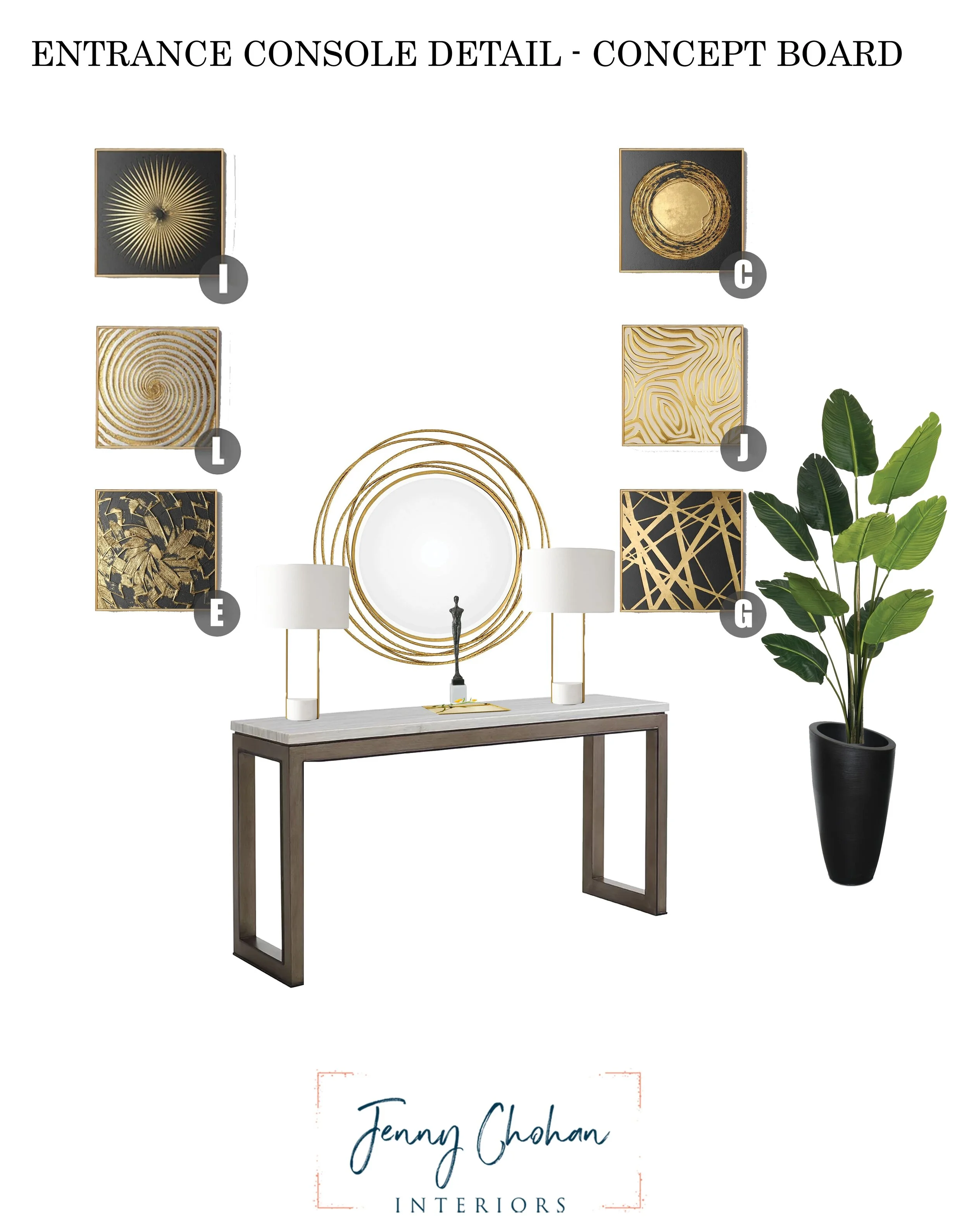
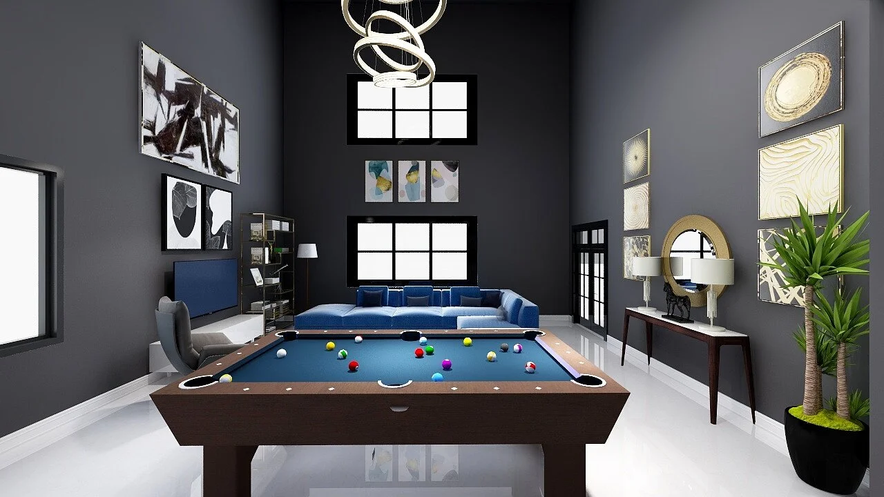
In this layout, as you enter the space you will see an entry console table with a couple of table lamps on the console that will help the space feel cozy. A perfect complement to tall walls is vertical artwork. We have placed artwork around the console to fill in the empty space and help draw the eyes upwards. As you enter in this area your eyes draw up to the ceiling and so to make a statement  a large fixture is chosen to connect the upper and lower portions of a room.

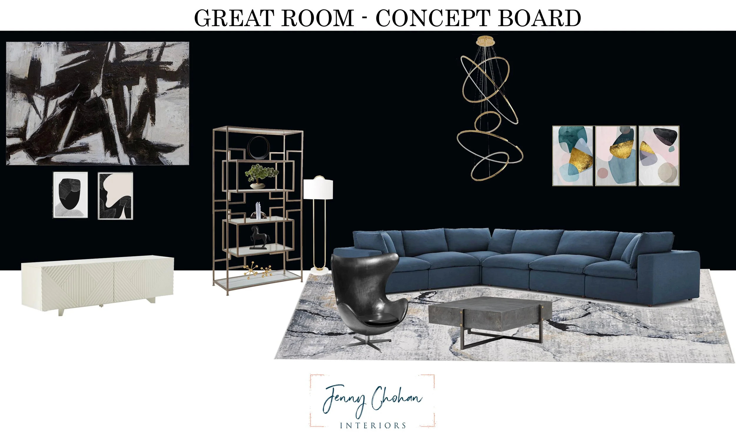
Later we collaborated on Pinterest and our clients chose from the given furnishing options. The next step in our process was to create a concept board with these furnishings and 3D renderings for the client to visualize the space.

CONCEPT-BOARD

CONCEPT-BOARD

ENTRY CONSOLE AREA-CONCEPT BOARD

ENTRY CONSOLE AREA-CONCEPT BOARD

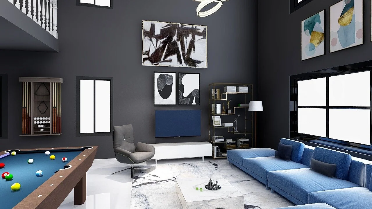
As they love black paint and wanted to paint the great room walls black, we showed them renderings with a couple of options to choose from. We have thought to paint the back wall with big windows black as an accent color which is a good way to accentuate height and help bring drama to the space. Or have the option to paint the whole main level and the loft, black.

3D Rendering

3D Rendering

3D Rendering

3D Rendering

As another requirement of the room is to have a media console. We have chosen to hang artwork above the television and a large single bold image will be a great way to connect your extra height to the rest of the interior. We have chosen a rug which will compliment the decor and furniture. A very minimalistic designed coffee table is placed in front of the sectional. The sectional is modular, which means each piece can be rearranged accordingly as needed.

minimalist-modern-design-style-great-room

 The pool table is placed in the dining area with a cue storage rack on the wall. 

3D Rendering

3D Rendering

With these renderings we could really help convey the design concepts for the space. At the end of the project we emailed them a final design package with shopping list to purchase furnishings and also set up Instructions. Our clients were very happy with the end result. This place will hence be a perfect cozy and inviting space for you to enjoy in years to come.

For additional inspirations, you may be interested in checking out my previous post on a home office, Living room and Coastal inspired bedroom projects.

If you are stumped on where to start with your home renovations, message me or email at jenny@jennychohaninteriors.com and I will be happy to come up with a design plan that will bring all your ideas to life.


GET YOUR COMPLIMENTARY E-BOOK

opt-in-image only.jpg

Sherwin-Williams 2021 Color of the Year

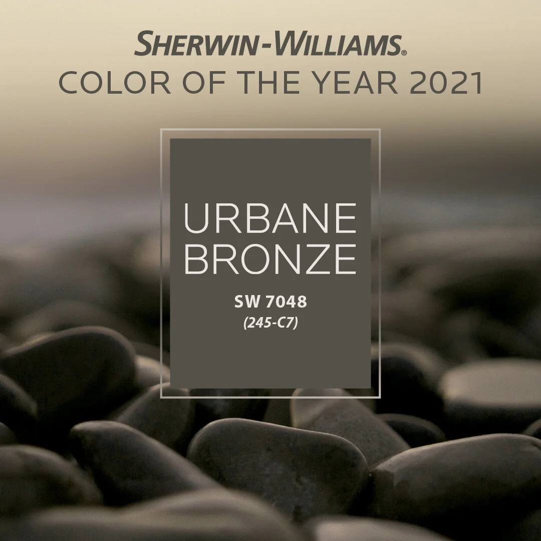
Rooted in nature, Urbane Bronze SW 7048 (245-C7) creates a sense of calm and serenity .png

Sherwin-Williams announced Urbane Bronze SW 7048 (245-C7), a color rooted in nature, as its 2021 Color of the Year. As the home becomes the ultimate retreat to help us feel safe and grounded, this warm and sophisticated bronze hue invites designers and homeowners to create a sanctuary in the spaces around them.

Urbane Bronze is a rich anchor that grounds the mind in calm and stability with its ties to the natural world. The color is part of the Sanctuary palette from Sherwin-Williams 2021 Colormix® Forecast, a collection of 40 trending hues, which focuses on the need for balance in design this upcoming year.

Photo Credit: Sherwin-Williams

Photo Credit: Sherwin-Williams

Sue Wadden, director of color marketing at Sherwin-Williams, describes Urbane Bronze as a comforting color that draws from nature and brings a feeling of relaxation and serenity. In addition, she explains, there's reassurance in its sentimentality, with nostalgic ties to design in the ‘70s and ‘90s, but with gray undertones that give it a distinctly modern twist.

Photo Credit: Sherwin-Williams

Photo Credit: Sherwin-Williams

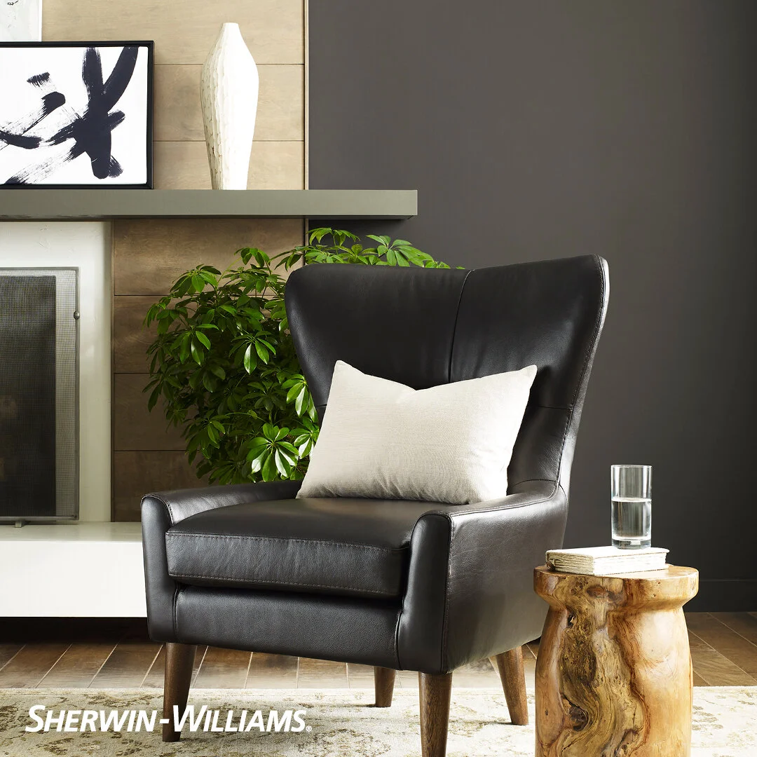
This new neutral is bold and understated at the same time and can be used as both a primary or accent color in interiors or exteriors. Paired with natural materials such as wood, stone accents or woven textiles, Urbane Bronze conveys a sense of calm in bedrooms, living rooms and home offices.

Photo Credit: Sherwin-Williams

Photo Credit: Sherwin-Williams

To create balance and a sense of calm in commercial spaces, combine this hue with elements of biophilic design, including large, light-filled spaces and indoor greenery, which continue to play an important role in the design world.

Photo Credit: Sherwin-Williams

Photo Credit: Sherwin-Williams

As more people seek to create a retreat from the world in the spaces around them, Urbane Bronze SW 7048 (245-C7) is an effective and easy way to deliver Zen in our daily lives.

What do you think of Sherwin-Williams 2021 Color of the Year? Let me know in the comments below!